Reflecting on Carnegie Corporation of New York’s impressive 114-year history, it’s easy to forget that this legacy is actually one of constant innovation. A timely reminder: the Corporation was the first major philanthropy, in 1995, to launch a website. Our site has undergone many changes in the 20 years since — just this summer, in fact, we overhauled it onto an entirely new platform.
It’s axiomatic that websites need a redesign every three to five years. The Corporation has done so, on average, every four years. Some upgrades were purely cosmetic, others involved a top-to-bottom rearchitecting of functionality and content. Until this year’s relaunch, though, the last major platform overhaul occurred in 2009. A lot has changed in web design since then. In this blog, and in a companion piece next week, I’ll share the strategy behind our latest effort.

Grantee Focused
Redesigning a website typically begins with defining content, audiences, and desired outcomes. In discussions with both internal and external stakeholders, we learned that grantees want to see their work showcased on our website — and, similarly, our program officers want the work of grantees to serve as the best illustration of the Corporation’s grantmaking strategy. This shared desire led us to streamline the text descriptions of programs and, instead, increase the number of news articles, social media posts, and other content about our grantees.
We’ve grouped grantee-focused content on revamped program pages, each with its own visual identity marked by a distinct color and icon. Page layouts also vary depending on a given program’s communications priorities, so each one feels like a discrete mini-site tailored to a specific audience.
Designed for Words
The Corporation’s approach to grantmaking focuses on supporting scholarship and the production of new knowledge. From a content perspective, this means our grantees and program officers write a lot of reports and strategy papers — which, in our old site’s design, made for dense, text-heavy pages.
Communications methods are constantly evolving and, increasingly, our grantees and program officers are using infographics, audio, video, and even interactive digital storytelling tools to broaden the reach and deepen the impact of their message. Although our new website includes all of these advanced multimedia features, we didn’t forget the importance of words. We paid special attention, in fact, to making text look as inviting as possible:
- our new typography is larger, clearer, and crisper, allowing words to pop from the page more legibly;
- color blocks and icons unique to each program create a bold, fresh look on pages that lack photos or other multimedia content;
- layouts afford breathing room between content elements, so pages avoid feeling too crowded; the entire website responds and resizes to look great on screens of all sizes, from desktop to smartphone — an important feature given that visitors using mobile devices now account for one-quarter of our online traffic.
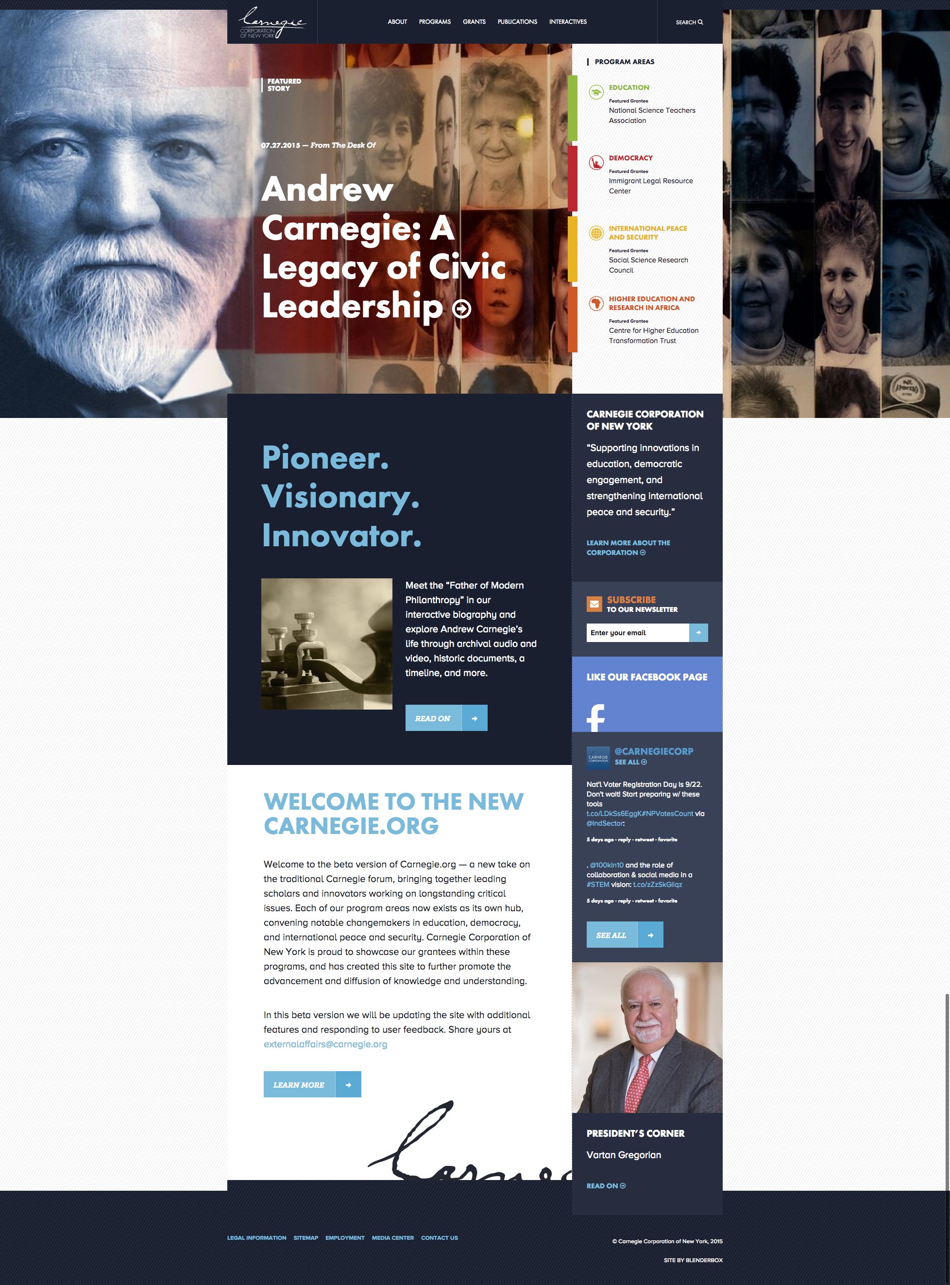
Streamlined
Our redesigned website addresses other trends related to mobile usage. Thanks to blogs and smartphones, both of which favor scrolling, people are now accustomed to navigating down through streams of content. Our homepage and program pages, as well as special pages on the biography of Andrew Carnegie and our “Pride of America: Great Immigrants” initiative, follow this blog-like long scroll. Similarly, in several areas within the “About” section we’ve combined multiple pages into longer, single ones.
After combining pages and eliminating outdated or redundant ones, our site shrank dramatically: from more than 200 pages down to just 90 (not including news articles, publications such as the Carnegie Reporter, and records in our grants database). Also gone are most of the confusing submenus that had previously buried and hidden content.
The streamlined new site is much easier to navigate and its content easier to find. Without the clutter, visitors can truly focus on our grantees and their work. In next week’s blog post I’ll talk about the teams that participated in this relaunch, our process, and some of the decisions we made about technology along the way.
